Creating Your First App
Apps in Sheety App provide a powerful way to create custom dashboards and visualizations for your data. This tutorial will guide you through creating your first app and understanding the available widget types.
What You’ll Learn
Section titled “What You’ll Learn”- How to access the Apps section
- Creating a new app
- Understanding available widget types
- Understanding app requirements
Prerequisites
Section titled “Prerequisites”- Access to Sheety App at your instance URL
- A workbook (created using the Creating Your First Workbook tutorial)
- At least one sheet with data
- A query created on your sheet (see Creating Sheet Queries tutorial)
Step 1: Accessing the Apps Section
Section titled “Step 1: Accessing the Apps Section”From your workbook, navigate to the Apps section by clicking on “Apps” in the left sidebar navigation.
When you first access the Apps section in a new workbook, you’ll see an empty state with a message “No apps available” and a call-to-action button to create your first app.

The Apps page shows:
- A search bar to filter apps (useful when you have multiple apps)
- An “ADD APP” button in the top right corner
- The current count of apps (0 apps found initially)
Step 2: Create a New App
Section titled “Step 2: Create a New App”To create your first app, click on the “CREATE FIRST APP” button (or “ADD APP” if you already have apps).
You’ll be taken to the app creation form.
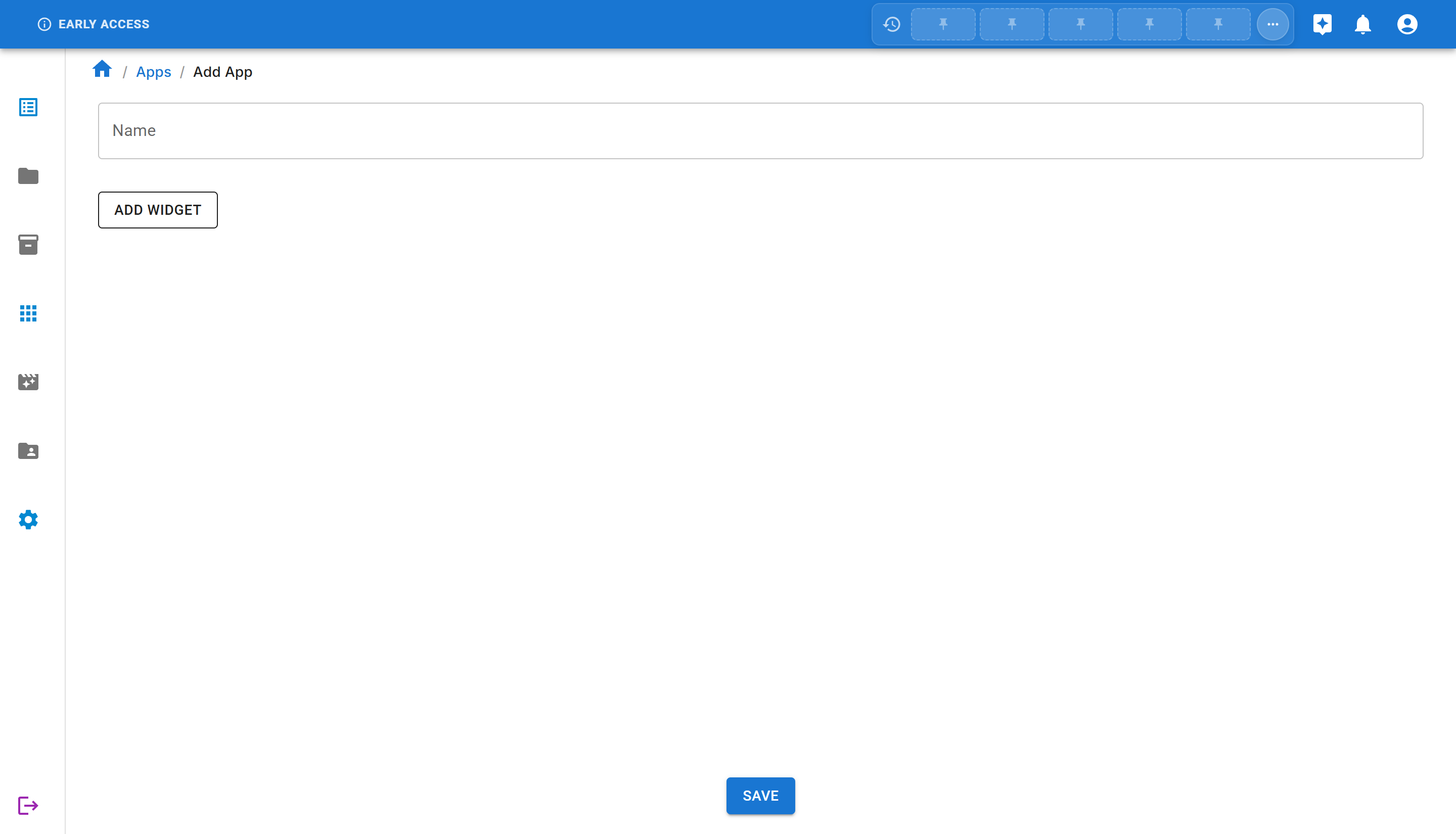
The form includes:
- Name: A text field to name your app
- Add Widget button: To add visualizations and data displays
- Save button: To save your app
Let’s create a dashboard app:
- Enter a name for your app, for example:
My Dashboard App
Step 3: Understanding Widget Types
Section titled “Step 3: Understanding Widget Types”Before saving the app, let’s explore the available widget types. Click on the “ADD WIDGET” button to see the available options.
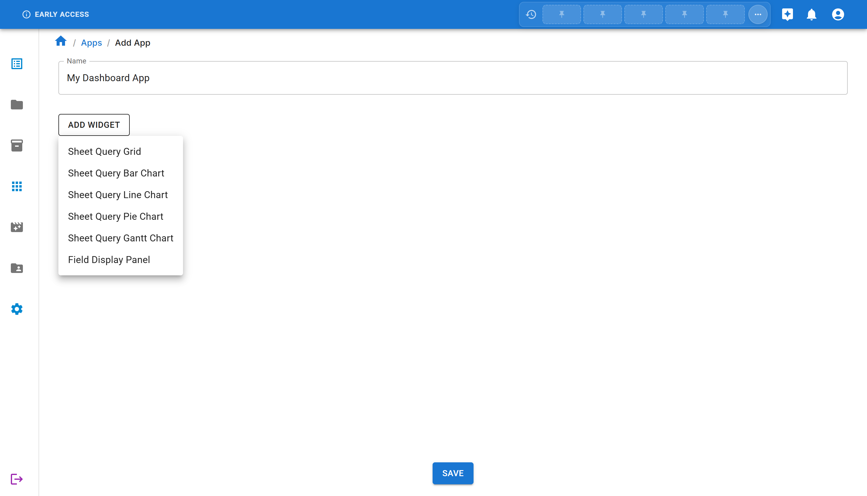
Sheety App offers several widget types:
Data Display Widgets
Section titled “Data Display Widgets”- Sheet Query Grid: Display your sheet data in a table/grid format with full query capabilities
- Field Display Panel: Show specific field values from your sheets
Chart Widgets
Section titled “Chart Widgets”- Sheet Query Bar Chart: Visualize your data using vertical or horizontal bars
- Sheet Query Line Chart: Display trends and changes over time
- Sheet Query Pie Chart: Show proportions and percentages
- Sheet Query Gantt Chart: Visualize project timelines and schedules
Each widget type allows you to:
- Connect to a specific sheet in your workbook
- Configure display options
- Apply filters and queries
- Customize appearance
Step 4: Widget Configuration
Section titled “Step 4: Widget Configuration”Most widgets in Sheety App are powered by queries, not directly by sheets. This allows you to:
- Filter and transform data before displaying it
- Select specific columns to show
- Apply aggregations (sum, average, count, etc.)
For this tutorial, we’ll create a basic app first, then in a later step, add a bar chart widget to visualize salary data by department.
Step 5: Save the App
Section titled “Step 5: Save the App”Once you’ve entered the app name and optionally added widgets, you can save your app.
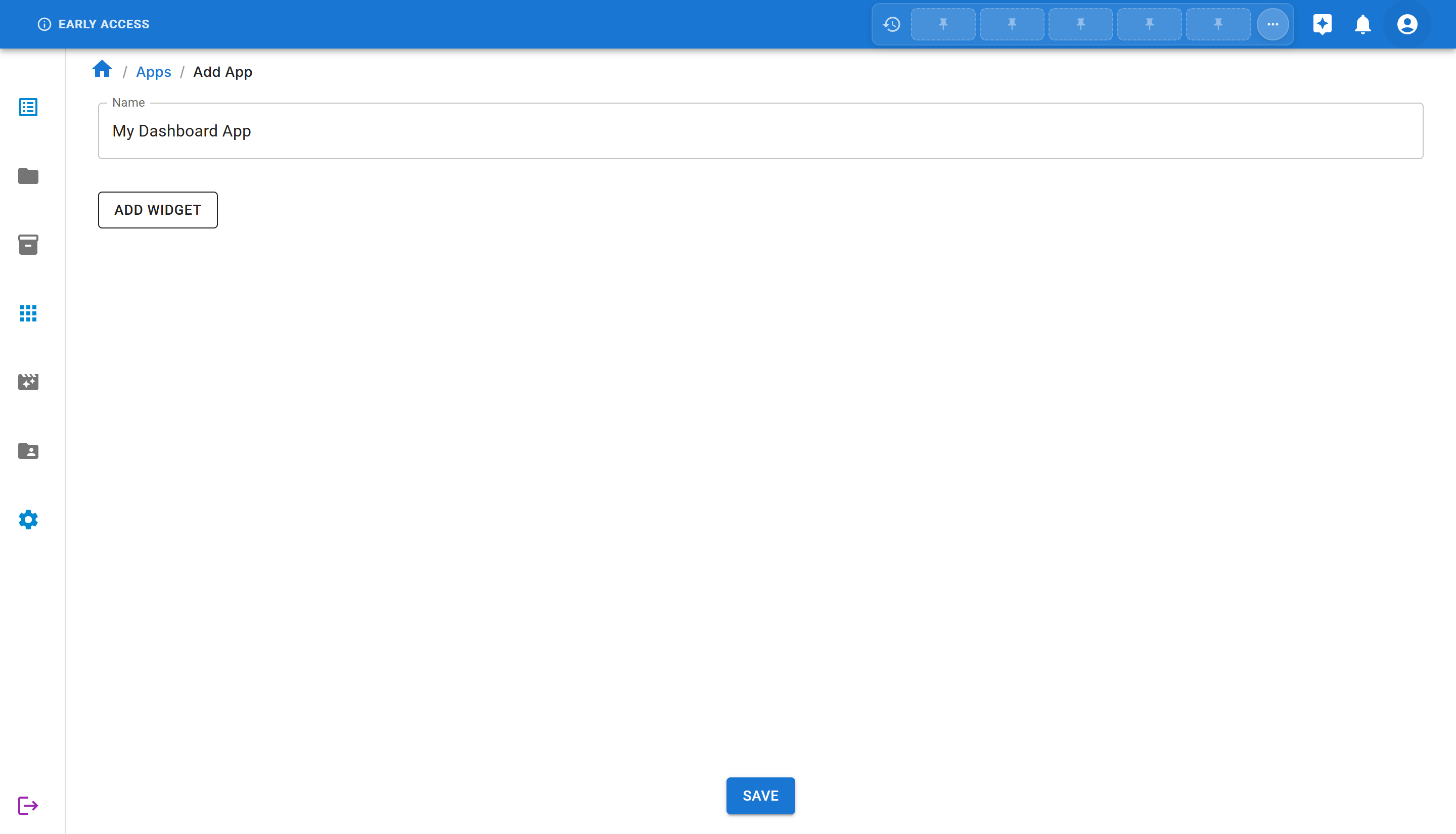
Click the “SAVE” button at the bottom of the page. The app will be created and you’ll be redirected to the app view.
You’ll see a success message “App created successfully” confirming that your app has been created.
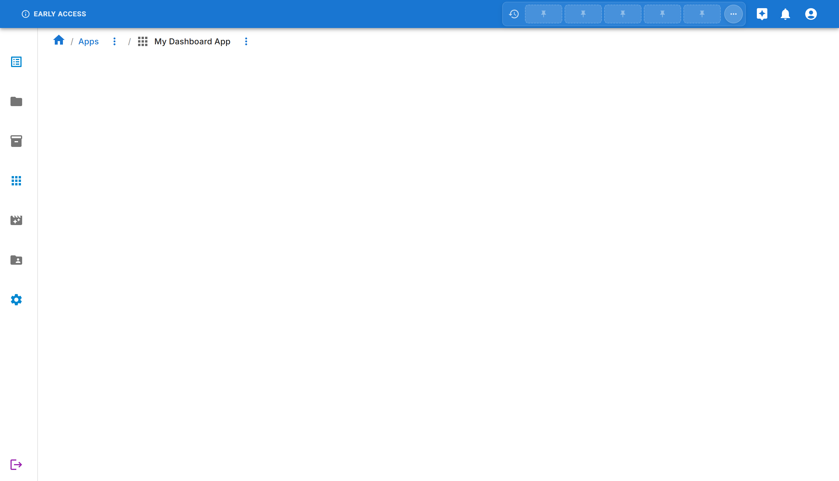
Step 6: Viewing Your Apps
Section titled “Step 6: Viewing Your Apps”Navigate back to the Apps page by clicking “Apps” in the breadcrumb navigation or sidebar.
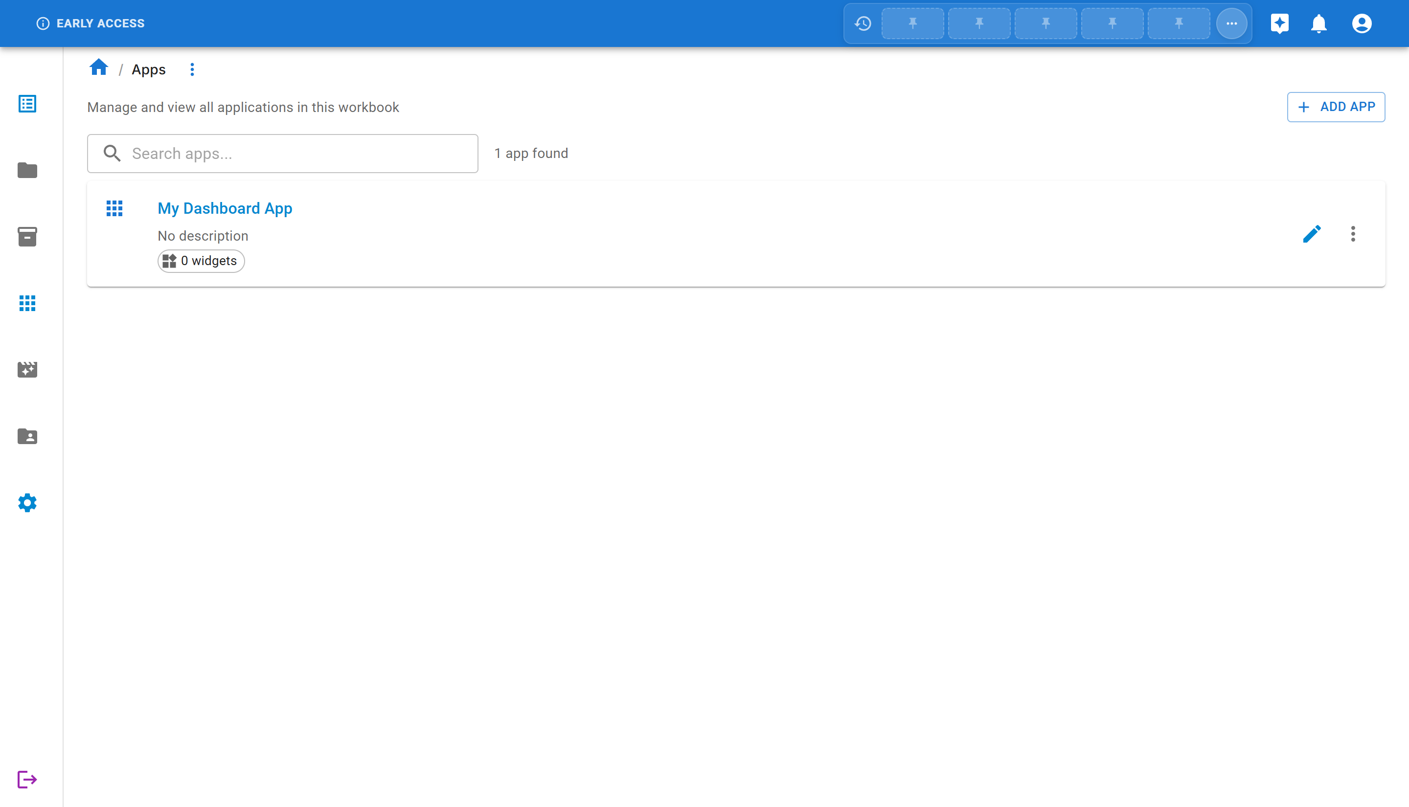
You’ll now see your newly created app in the list with:
- App name: “My Dashboard App”
- Description: Shows “No description” if you didn’t add one
- Widget count: Shows “0 widgets” since we didn’t add any widgets yet
- Edit button: To modify the app
- More actions menu: For additional options
Step 7: Adding a Widget to Your App
Section titled “Step 7: Adding a Widget to Your App”Now let’s enhance our app by adding a bar chart widget to visualize salary data by department.
Prerequisites
Section titled “Prerequisites”Before adding a widget, make sure you have:
- A sheet with employee data (Department and Salary columns)
- A query that selects Department and Salary columns (see Creating Sheet Queries)
Edit the App
Section titled “Edit the App”From the Apps list, click the “Edit App” button (pencil icon) on your app card, or use the “more options” menu on the app detail page and select “Edit App”.
You’ll be taken to the app edit page where you can add and configure widgets.
Add a Bar Chart Widget
Section titled “Add a Bar Chart Widget”Click the “ADD WIDGET” button and select “Sheet Query Bar Chart” from the menu.
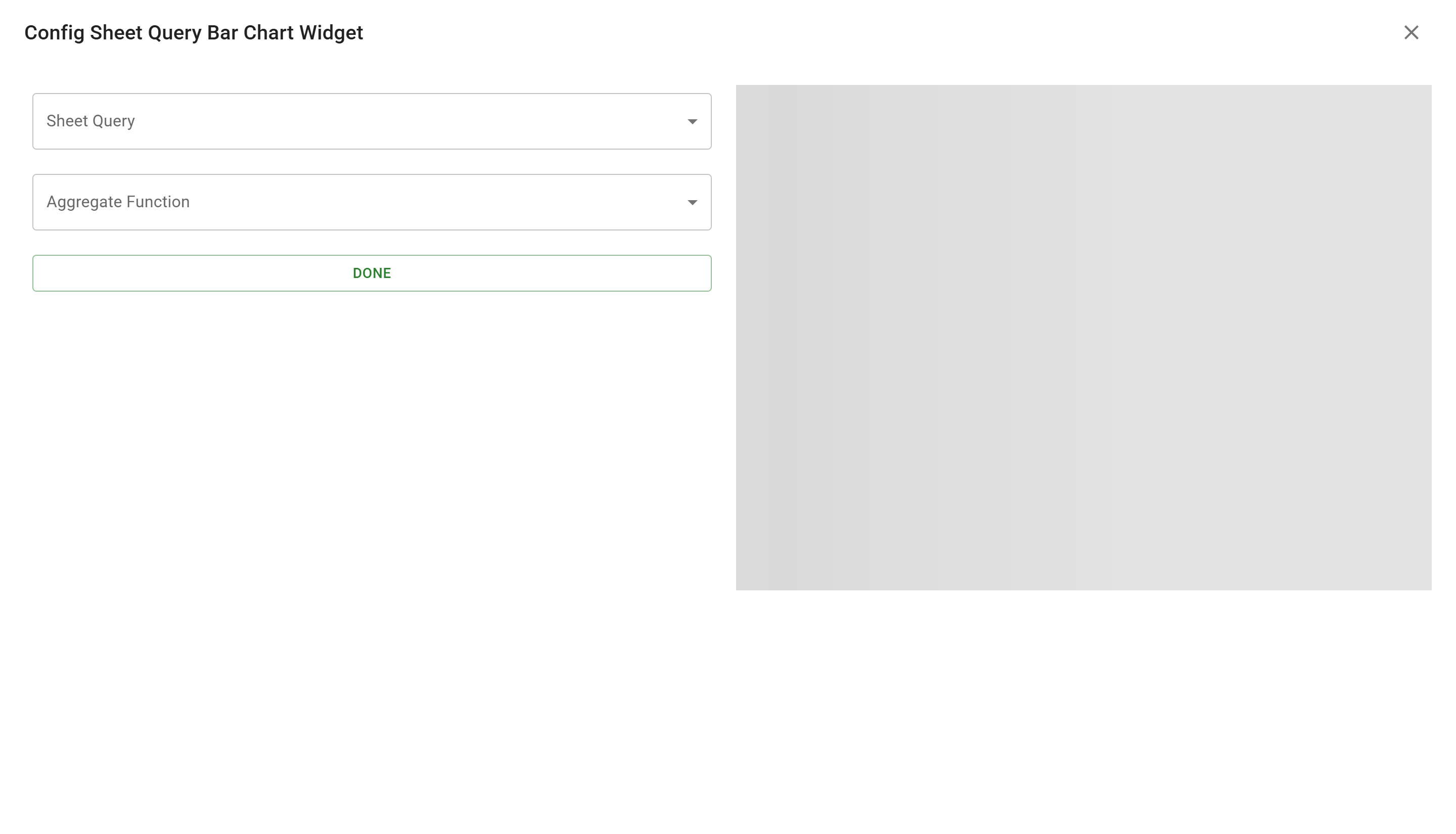
The bar chart configuration dialog appears with two main fields:
- Sheet Query: Select the query that provides the data
- Aggregate Function: Choose how to aggregate the data
Select Your Query
Section titled “Select Your Query”Click on the “Sheet Query” dropdown and select your query (e.g., “Salary by Department”).
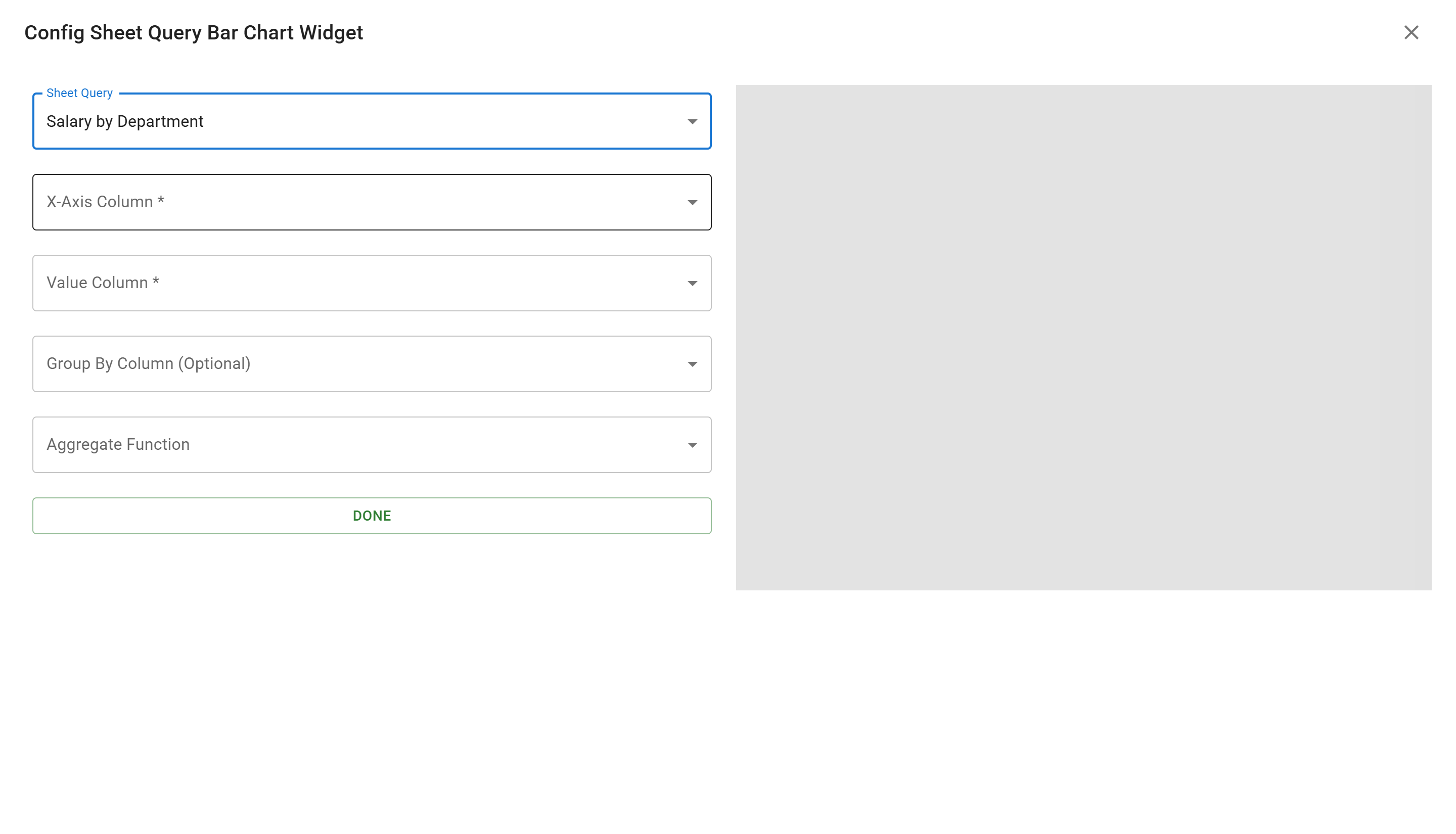
Once you select a query, additional configuration options appear:
- X-Axis Column: The column to use for the horizontal axis (categories)
- Value Column: The column to use for the vertical axis (values)
- Group By Column: Optional grouping for stacked or grouped bars
- Aggregate Function: How to combine multiple values (Sum, Average, Count, Min, Max)
Configure the Chart
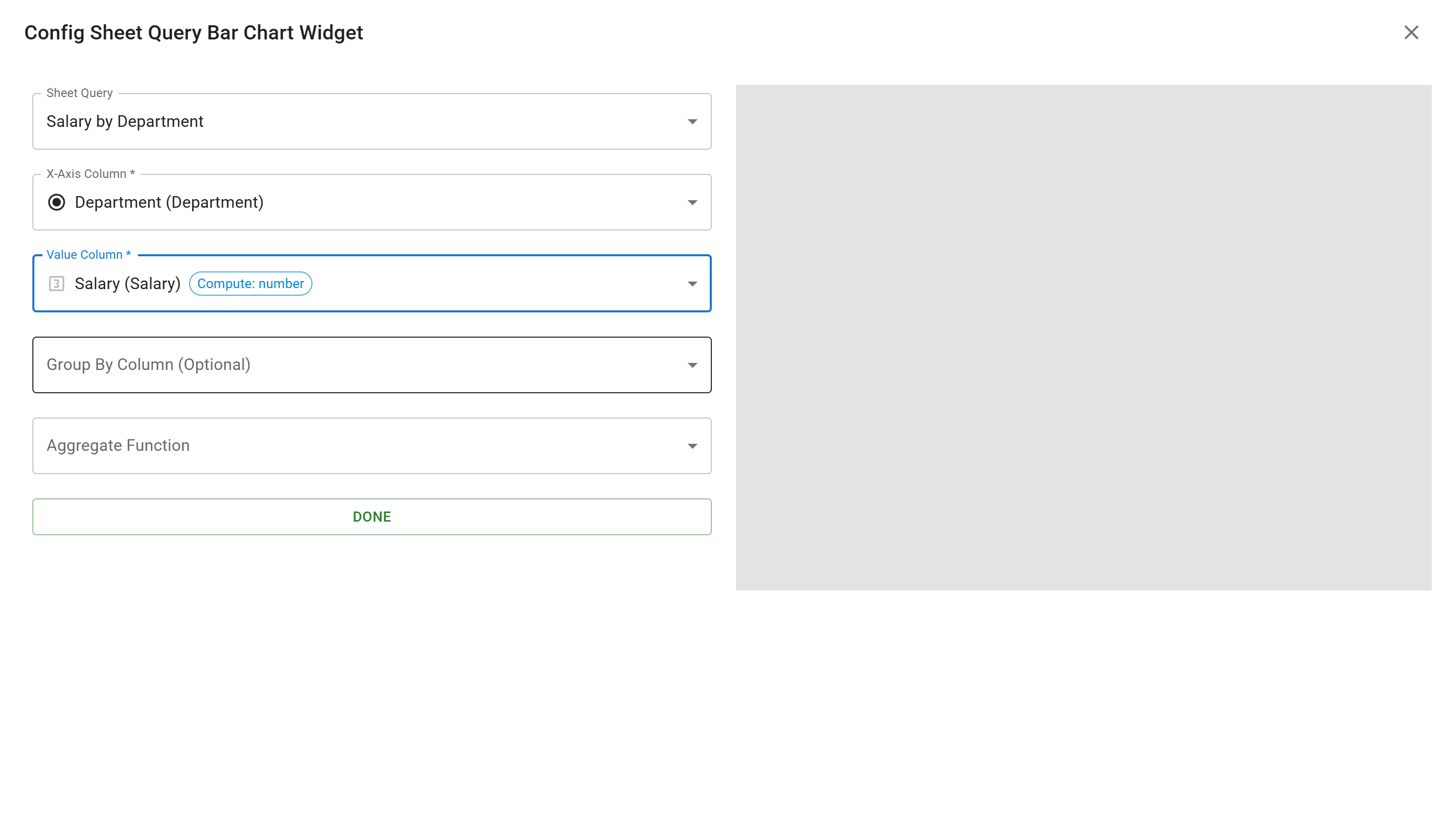
Section titled “Configure the Chart”For our salary by department visualization:
- X-Axis Column: Select “Department (Department)” - this will show department names on the X-axis
- Value Column: Select “Salary (Salary)” - this will show salary values on the Y-axis
- Group By Column: Leave empty (optional for more complex charts)
- Aggregate Function: Select “Sum” - this will add up all salaries per department
Preview the Chart
Section titled “Preview the Chart”As you configure the widget, a preview appears on the right side of the dialog showing how your chart will look.
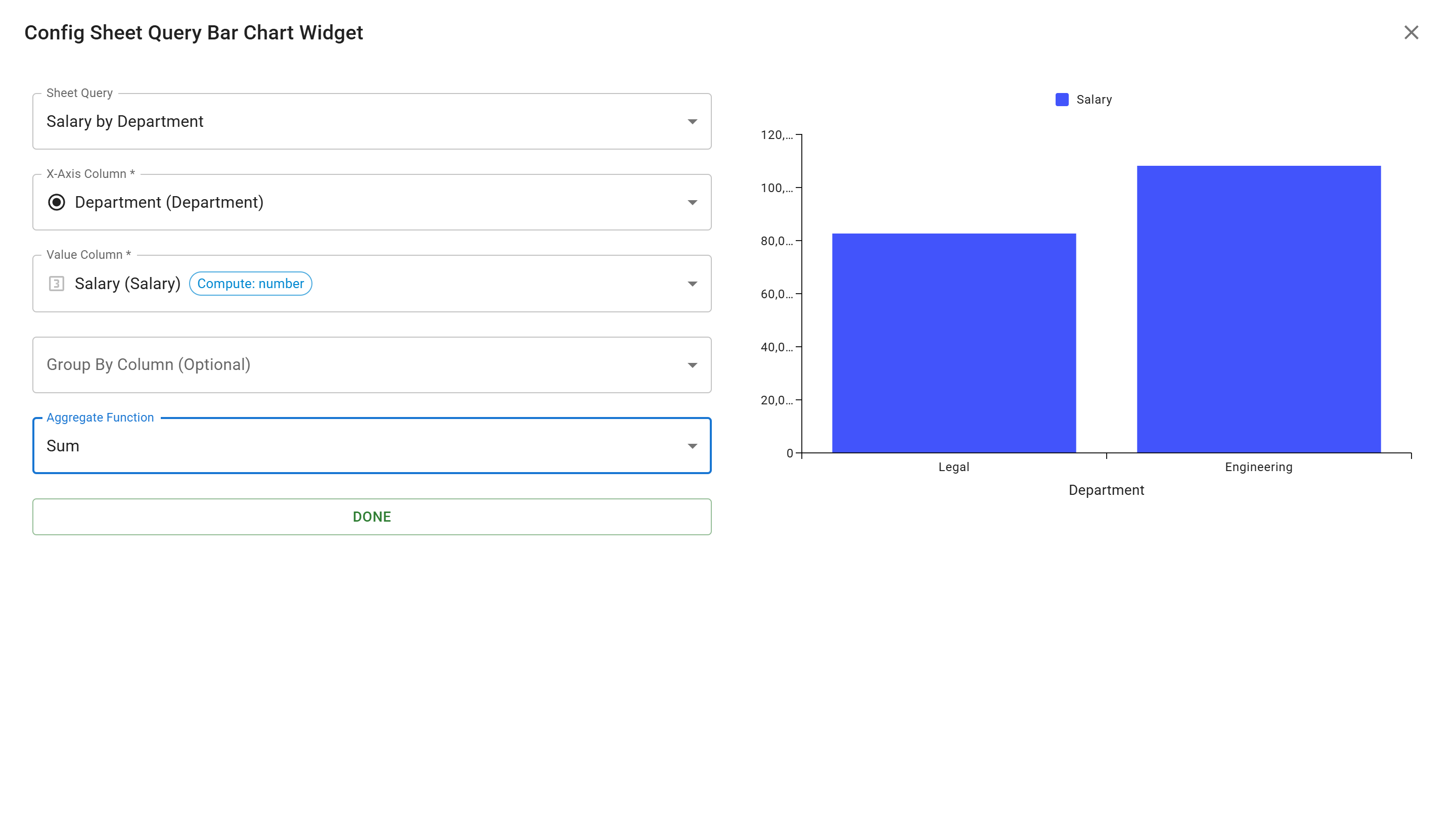
The preview shows:
- Department names on the X-axis (Legal, Engineering)
- Total salary values on the Y-axis
- Blue bars representing the aggregated salary for each department
Save the Widget
Section titled “Save the Widget”Click the “DONE” button to add the widget to your app. You’ll see the bar chart appear on the app edit page.
Notice the “Unsaved changes” indicator in the top right, letting you know the app needs to be saved.
Save the App
Section titled “Save the App”Click the “SAVE” button to save your app with the new widget.
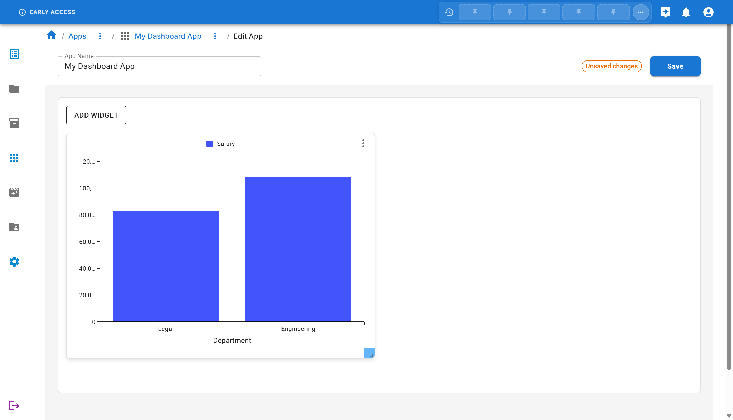
View the Final App
Section titled “View the Final App”Navigate back to the app view by clicking on the app name in the breadcrumb. You’ll now see your completed dashboard with the salary by department bar chart!

The app displays a beautiful bar chart showing the total salary for each department:
- Legal department: ~$82,500
- Engineering department: ~$108,000
Next Steps
Section titled “Next Steps”Now that you’ve created your first app with a widget, you can:
- Add More Widgets: Try adding different widget types (line charts, pie charts, grids)
- Create More Queries: Build queries with filters and different column combinations
- Customize Widget Layout: Arrange multiple widgets on your app dashboard
- Create Multiple Apps: Build specialized dashboards for different purposes
- Explore Aggregation Functions: Try Average, Count, Min, and Max functions
Summary
Section titled “Summary”Congratulations! You’ve successfully created your first app with a data visualization widget in Sheety App. You learned:
- ✅ How to navigate to the Apps section
- ✅ The different widget types available (grids, bar charts, line charts, pie charts, Gantt charts, field panels)
- ✅ How to create and save an app
- ✅ How to view and manage your apps
- ✅ How to create queries for widgets
- ✅ How to add and configure a bar chart widget
- ✅ How to use aggregation functions to summarize data
- ✅ How to save and view your completed dashboard
Apps combined with queries provide a powerful way to build custom dashboards and visualizations in Sheety App. Experiment with different widget types, queries, and aggregation functions to create the perfect dashboard for your needs!